Why Inspiration Matters – Moodboard in UX/UI mobile app design

Paulina Chmielewska

Jakub Dobek

Piotr Niedźwiecki
Inspiration or imitation? Where does inspiration end, and copying start? How do you know if you’re still looking for new, original ideas or simply taking other people’s work and imitating it? There’s a fine line separating inspiration from plagiarism. Still, it is worth to look for inspiration in the works of others and from that define your own path. There is nothing wrong with drawing from the creativity of others, being inspired by their style and then creating your own solutions based on these. We say a definite No to plagiarisms, but still strongly encourage inspiration.
Table of Contents
- Can you draw inspiration from others’ creations?
- What is a Moodboard?
- Why do we create Moodboards?
- How to create a digital moodboard?
- Moodboard examples
- Moodboard inspiration!
– Online portals for moodboard inspiration
– Android / iOS Guildelines
– Good designers to look at for moodboard inspiration
– Where to look for ready-made elements? - Should you look for inspiration?
Can you draw inspiration from others’ creations?
We live in a world where we attempt to measure everything, including talent and skill. However, we often skip the important aspect of creativity – the inspiration. To be inspired is to open your eyes us to new possibilities. We need inspiration if we are to test and exceed our limits. Inspiration makes us change the way we perceive our own capabilities. Research shows that inspiration can be stimulated, activated and manipulated, to positively affect the results of our work.
Creativity is a hard resource to come by, and even the most creative minds sometimes hit a wall. We try our best to come up with the new and original, yet our efforts get hindered by internal limitations. So it’s worth having your own, tested ways to look for inspiration whenever you need to improve your creative potential and effectively remove anything that blocks you.
Remember: get inspired – don’t imitate!
What is a moodboard?
A moodboard is a visual representation of a concept design in the form of a collection of inspirations. The name is actually quite accurate as it is in essence a board of moods placed together by the designer. The idea of moodboards is to organize your inspirations at the stage of creating the concept, whether it’s a mobile application (as in the case of our company) or any other creative work – interior design, fashion, etc.
A moodboard can be in both digital and/or in physical form. In the first case, we create a collage of selected materials using software, in the case of an “analog” board we can use paper, cork board or a wall, where we paste magazine clippings, materials, photos, etc.
Why do we create Moodboards?
Moodboard is usually created at the initial phase of the project. It can be used both for designer’s needs and for the needs of the whole team responsible for creating a concept. We can also utilize it to provide the client with ideas, concepts and the general direction we want to take for the design.
A moodboard can be very helpful in organizing ideas. By putting all concepts and inspirations in one place, we can quickly and effectively verify the composition and its harmony. It may turn out that the proposed colors, patterns or motifs do not necessarily harmonize – a mood board will help us set and keep our direction from the very beginning and save time at further stages. In this way, we verify our ideas at the very beginning and confirm whether the effect are indeed as intended.
Moodboard is also a great cure for lack of ideas. In all creative work there are moments of confusion and being unsure about the way we should proceed with work. Looking at things we like and enjoy that also match our concept and inspires us, we can decide much quicker about next steps to take.
How to create a digital moodboard?
In our article, due to the nature of itCraft’s, and our UX / UI designers work, we will focus on digital moodboards.
Remember that moodboard does not have to be a boring PDF or spreadsheet in Photoshop or other tool that you use. You need not restrict yourself to a few photos found on the Internet. make sure you include all kinds of things that inspire you. Music? Video? Photography? Colors? Draw on everything that lights the creative spark in you.
To create a moodboard, you just need to pick a graphics software, collect materials from portals such as Pinterest, throw everything into one folder, and eg. use a Moodboard creation program to render one for you automatically.
Moodboard’s job is to inspire and aide in the creative process, not to be a necessity – if you think that bookmarks in the browser will be more effective, then by all means – collect your inspirations this way. If you’d rather hand-craft a collage out of the collected materials, do it this way. There are no good or bad ways here – just whatever works for you.
Moodboard examples
A moodboard helps in defining key graphic elements that will be used in further stages of the project, e.g. the color theme, buttons style, windows layout, typeface, fonts, iconography.
It also plays a helpful role during conversations with the client regarding the graphic concept of the project. It allows to present designer’s ideas visually and compare them with the client’s expectations.
Below are the Moodboards we created at itCraft when designing two different mobile applications.
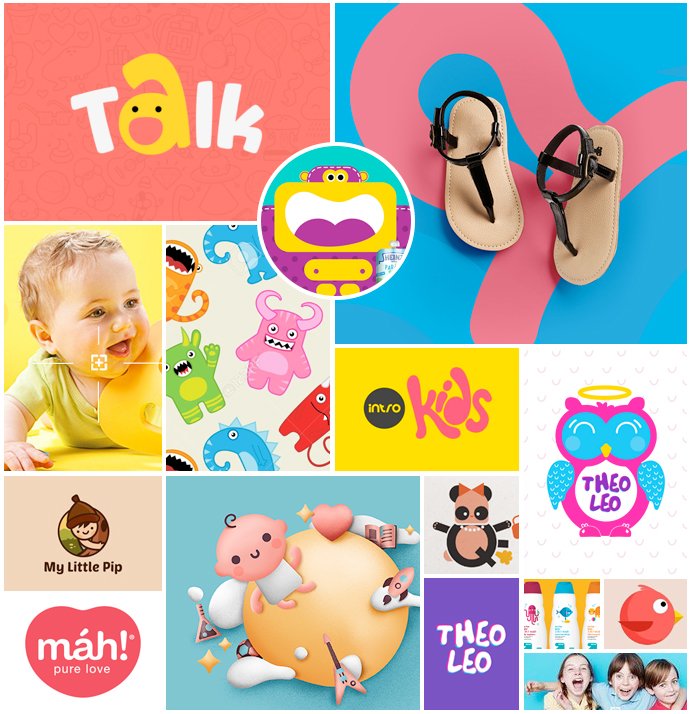
Our moodboard for “Pixoo” – an app for parents to post their children’s stories – allowed us to determine the general style of the application (fonts, color scheme, photos styling). It was also a very helpful tool to starting work on the application logo.
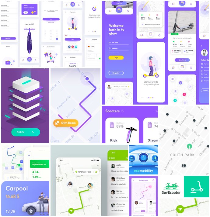
The moodboard for “Scooter sharing” app helped us select and define the style of the crucial interface elements in line with market trends in ride sharing and navigation apps. Among others, we defined the look of: map pointers, vehicle information, onboarding screens, ride stats, summaries. Based on it, we also selected the general color scheme, fonts style and graphics.
Moodboard inspiration!
Inspiration can be found virtually everywhere. Just look around and take in your surroundings. It happens sometimes that we are surrounded with too much order and predictability to feel inspired. That is where moodboards come in, introducing some color and chaos to help kickstart the creative process for our UX / UI Designers.
Online portals for moodboard inspiration
1. Behance – A collection of portfolios by designers from all around the world. A wide variety of themes, huge number of presented works – from icons, through illustrations, to the entire use cases, brand building processes, visual identification, applications’ UIs, websites.
2. Dribbble – As above, with the difference that the presented graphics are presented in short, concise form of shots.
3. Medium.com – Design Section, UX – A lot of interesting articles about the process, design workshop,as well as lists of interesting works of other designers
4. Pttrns. and Mobbin – Galleries of ready-made UI mobile solutions projects for both iOS and Android
5. Mobile Design Inspiration – Galleries presenting UI web / mobile projects as well as animations for interaction design.
6. Designinspiration – Examples of designers’ work in various fields. A base for inspirations regarding e.g. color selection, shapes and fonts.
7. Pinterest – among the collection of different images, you can find many inspiring graphic designs, eg under the phrase: “clean ui for mobile app” or “rwd website design” and attach them (“pin”) to your own “array” creating something like private moodboards ..
8. Abduzeedo – A large base of inspiration from various fields – graphic design, photography, 3D graphics.
Android / iOS Guildelines
When designing graphics for mobile devices, we keep in mind the limitations and the fact that even the most beautiful design may prove impossible or difficult to implement if it’s not prepared in accordance with the OS’s manufacturer’s guidelines for the device.
To avoid this type of mishaps we work by the guidelines, which can be found on Apple and Google’s websites. They contain a lot of valuable info for designers – tips, examples of use, examples of native components, as well as downloadable resources.
iOS – “Human Interface Guidelines”
Android – “Material design”
Good designers to look at for moodboard inspiration
Blind Agency / blind.com
They have in their portfolio brands like Microsoft, Harman / Kardon and Coldplay band. Despite winning many awards, they still share their knowledge of graphic design, ux and ui, with others, educate and inspire on their YouTube channel as thefutur.com.
Aaron Draplin
Graphic designer who collaborated with Nike, Burton and Ford. In his numerous online movies, TED Talks, Google talks, he presents the graphic design process in a very accessible way.
Ales Nesetril
A young, talented designer working as a Design Team Lead at STRV. His portfolio comprises projects for Tinder, Boosted Boards, Lufthansa and Flip and many others. His designs are characterized by simplicity and thoughtfulness.
Gleb Kuznetsov
Undoubtedly, an outstanding designer. In his projects, he often combines the interface with video, producing amazing end result. His portfolio is a great place for inspiration for many designers.
Where to look for ready-made elements?
Sketch resources of various types: https://www.sketchappsources.com/
Free photography bank: https://unsplash.com/
Icons: https://material.io/resources/icons/
Various types of graphic resources, e.g. mockups, fonts, icons: https://graphicburger.com/
Fonts:
https://www.fontsquirrel.com/
https://fonts.google.com/
Should you look for inspiration?
Certainly yes – if you need it. There is nothing wrong with inspiration as long as it doesn’t turn into plagiarism. Finding inspiration is not easy. Even if creative work is your daily bread. Go for developing your own style, but do not limit yourself to what others create. Watching what others do can help a lot, but adding your own flavors is what makes it special.
“You can’t wait for inspiration. You have to go after it with a club” – Jack London
However, inspiration is not a must. If you have a complete concept in your mind, you do not need additional stimuli to generate ideas all by yourself. Inspiration is an auxiliary tool for when you think you need it. Keep in mind that there are ways and tools that can be used at those times to help you pick the right direction and create.
Read more about UX design:
UX/UI Design – the make or break of mobile apps
Starting UX design – User Flow and Interactive Prototypes
Creating the User Journey – map of screens
Why are UX Design workshops the right way to start your project
