How did we conduct usability testing of the interactive EdTech application?

Justyna Pieczka
About the project
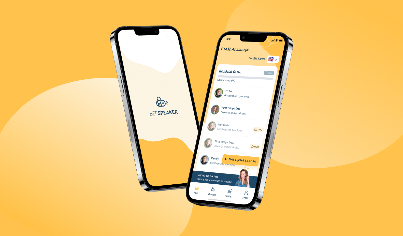
BeeSpeaker is an EdTech mobile app that teaches foreign languages by interactive videos with native speakers.
BeeSpeaker revolutionalizes mobile learning combining a tool focusing on speech teaching and a pleasant form of videos with native speakers. Thanks to self-learning speech recognition, the interface of the app is controlled by the spoken words. That’s the power of educational technology.
Research process – how was the study conducted?
Defining goals
We started with the key thing of the whole study – goals. We didn’t know we were going to incorporate usability testing because first, we had to have a helicopter view of the situation and gather data we needed. Before identifying the goals we had several meeting with the Product Manager to be sure we had a deep understanding of the App, the reasons for conducting the research, and issues that should be analyzed. Having the goals ready we used them to define research questions. For every particular goal, we created several general questions.
Defining methodology
Taking into consideration the research goals and questions, we came to the conclusion that a usability study combined with elements of in-depth user interviews would be the best choice.
Recruiting participants
Although we got a list of potential participants from the App’s Team, we decided to send them a screening survey first to be sure they would meet all the criteria of our target audience. It enabled us to choose 6 people who:
- have never used the app before
- are tech-savvy app users
- use mobile apps and digital tools on mobile phones on a daily basis
- have English level between A1-B1
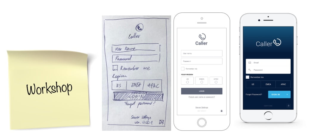
Creating scenario
The scenario was quite complex and consisted of 3 different flows depending on which of them was chosen by the user. We decided to give participants a lot of freedom while exploring the app. Like in a ‘real life use’ user tests – every person can take another path after entering the app.
Study checklist
First meetings can be a bit stressful, that’s why a checklist (kind of usability questionnaire) prepared before them helped us to focus on the study itself, not on the all additional stuff. It was reminding us to build a rapport with participants, keep our emotions neutral and introduce the think-aloud method. Participants aren’t being tested and we have to make them feel comfortable. It’s not a laboratory-like user testing, life is not about lab conditions.
Usability testing
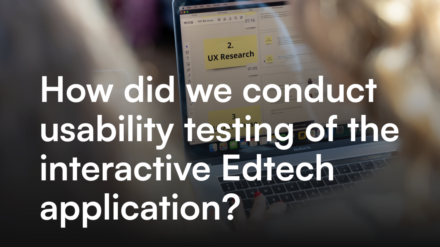
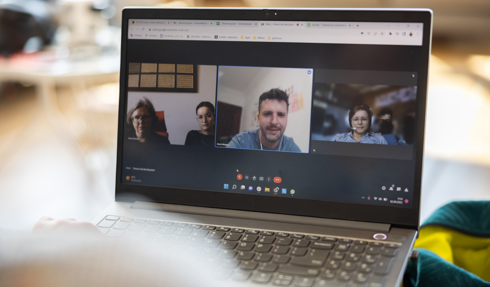
We managed to conduct 5 sessions of usability evaluation combined with short user interviews. We didn’t have to use the app prototype because the app was already alive. The only thing was asking participants to use their mobile devices during the usability tests. At the meetings, one of us was a moderator leading the usability test and another one was taking notes in form of sticky notes in Miro. We had 5 sessions with participants aged between 25-36 who represented the target group of the product.

Analyzing notes
We chose the problem matrix method to organize notes and start data analysis. Then we created a table summarizing every part of the study and including:
- main problems & conclusions – to generally describe the most relevant issues appearing during conducting usability testing
- representative participant quote – to show the problem the way a user see it and help empathising with them
- our recommendations – to propose a possible modification of user interface to improve this part of user experience
Creating report
We created a report for the Product Manager and the stakeholders to summarise the most relevant findings. The report included three parts:
- Study details – goals, methodology, participants details, etc.
- Issues – described by observations, interpretation and recommendation
- Prioritized list of recommendations and conclusions – to provide a ready to use roadmap of modifications for the Product Manager
Study results – what did the study show?
User insights
Based on initial interviews we were able to gather insights about the general attitude toward language learning, learning materials and collaborative learning methods.
Among the general main problems we discovered lack of time, speaking barrier and no way to practice language. On the other hand, relevant motivators turned out to be gamification, push notifications and eagerness to develop professionally.
Use of similar applications
Since we decided to choose participants who were tech-savvy, it turned out they use many digital tools and also other language learning apps so they already have some habits connected with their use. Our target group reaches for the app spontaneously, e.g. waiting for a meeting, after getting a notification or during their leisure time, after work.
What do they miss in current apps? The most important element for them turned out to be interactive learning. They also mentioned a need of breaking the language barrier by speaking, hardness of using the right tenses and lack of ways for learning specialist vocabulary. Thus, our product is kind of a higher education method. Plus, it has mobile learning analytics.
Key observations & recommendations
Below you can find a few of all the observations we included in the final report.
Observation 1 – Onboarding survey
- All users wanted to tick more than 1 option for the language level and didn’t know what to select.
- Some users wanted to tick more than 1 option when asked about learning barriers.
Remark: Users were completing the survey carefully – it would make sense to use the collected data later in the app so that the user has more personalized elements. Besides, they’re probably doing it so thoroughly because they thought they’re setting up the app for themselves.
Recommendations:
- In the onboarding survey, the form of answering questions on language level and user barriers should be changed so that you can select more than 1 answer or the answers should be clearer (at least when asked about the level).
Observation 2 – Setting a goal
- Everyone was very eager to set up notifications.
Remark: There was a remark that you don’t know how long the lesson lasts, so we don’t know how much time you need. Cognitive load should be balanced.
Recommendations:
- Setting up notifications should be a well-developed process, as it is a very important element of the application for users. In addition, you need to investigate how setting the daily target of the words (to be entered in the newest version of the application) will work.
Observation 3 – Lessons
- Users had no idea what to do after the first question from a teacher.
- Most users pressed the microphone when they wanted to speak.
- Almost no one used the buttons in the lesson.
- There were problems remembering sentences that had to be repeated when they were longer.
- When the app didn’t accept the answers, some participants clicked nervously all over the screen because they didn’t know what to do.
Recommendations:
- Lessons and reviews screens should be standardized (navigation, subtitle position).
- First lesson or demo with an explanation, illumination of the microphone and text message should be created.
- In the case of long sentences, display them in full or consider changing the maximum length of sentences.
Observation 4 – PRO benefits – how to find them
- For some participants it was not obvious that the PRO benefits can be found under the PRO activation button on the limit screen. What’s more, no one pressed the PRO activation bar at the bottom of the screen, which can suggest a banner blindness reaction.
- In order to find benefits, users often went to the profile.
Recommendations:
- Since the bar at the bottom of the screen is not very visible because of the banner blindness, it could be redesigned so that it would not be similar to a typical ad. Another solution would be displaying some of the PRO version benefits to draw user’s attention and lead to another place only to show more of them. That was insightful user test.
General conclusions
Apart from prioritized issues and recommendations, we presented also conclusions about the entire product, to sum up the feedback we gained from the participants.
- Way of learning – multiple users like the new form of online learning and find it interactive. They consider it as an opportunity to learn especially speaking.
- Issues in the app – Technical problems in the application significantly influence evaluating usability, they are irritating for users, sometimes even leading to anger and frustration.
- Onboarding – the onboarding lesson plays a crucial role in entire perception of the app – it is the first time a user has to say something to a device.
Lessons learned
There are few tips we can give you based on the conclusions we drew after conducting this user research session.
- Define the scope of the study and be sure the product and any part of the user interface won’t be changed during the whole research session – if you conduct the study for such a dynamic company like a startup, confirm with the person responsible for the product that nothing new will be introduced in this time. The state of the app that is being tested should match to the scenario we prepared before.
- Do a proper introduction – when introducing the subject and the rules of the study don’t forget to say few words about yourself and your colleague and explain who will be doing what. Making participants feel informed will help them to be more confident and relaxed during the study. It’s not about test users in the lab conditions.
- Go deeper – when a participant says something additional, don’t hesitate to ask more in-depth questions. You have to be sure that you fully understand a user to not draw wrong conclusions.
- Be constantly focused – the best option, especially if you aren’t a very experienced researcher, is to conduct the meeting in 2 people. One of you can be a moderator asking question, and the second one can take notes. What’s important, observe not only what a user is tapping and saying but also what they wanted to tap but they didn’t. Systematic review of all aspects of using an app pays off. User interfaces have to be visually attractive but also intuitive.
Next steps – what to do next?
Since BeeSpeaker is constantly developing, it’s crucial – on the one hand to keep in touch with the users, on the other hand, to rely on the quantitative data while making decisions about the further direction of the product development.
These are the next steps we recommended to take:
- Implementing provided solutions – all of them were assigned to priorities that take into consideration not only the easiness of development but also business justification. The ones with the highest priority should be introduced to the project as soon as possible.
- Introducing product analytics – based on conducted research there are many fields that would require using product analytics tools and data collection. Tracking and analyzing real user behavior together with usability studies can give a broader picture of the product. Data science, usability engineering, eye tracking – combining multiple methods and factors translates to success.
- Further user research – regular user research including various research methods like user interviews and usability testing will bring great value to the product. Product management can be then based on real data from user feedback and usability metrics, not only on managers’ assumptions and expectations, and provide a top-notch user experience.