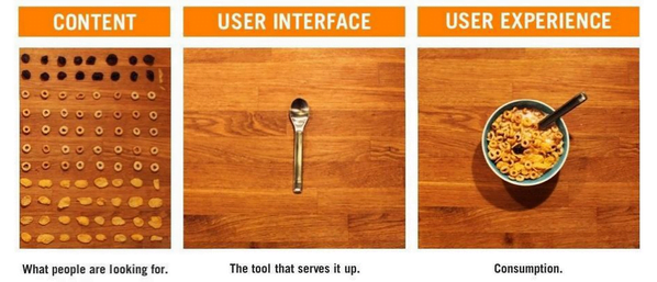
UX/UI Design – the make or break of mobile apps

Aneta Romankiewicz
At the beginning of my adventure with the design I heard that although it’s the creators that define the purpose of the application, it’s the users who define what for and how they will utilize it.
Table of contents
- Why do we need UX / UI Design?
- Who is a UX Designer?
- Who is a UI Designer?
- The world of UX
- User Experience Principles
- The phases of design
- Features of good UI
- Tools and presentation
- Summary
Our clients set the business requirements of their apps. Our task is to turn those requirements into user-friendly features and functionalities. We strive to provide a product that is easy to use and gives users a positive experience. Application design may not seem like a difficult task.
All in all, it’s the client who should know exactly what the application is supposed to do, so their requirements should be enough to create the adequate user experience. Unfortunately, the UX / UI Design process is not that simple. An app is not just the looks as ordered by the client – the analysis and research of user behaviors play a crucial role here.
Why do we need UX / UI Design?
Have you ever used an application which despite beautiful appearance was really hard to use for you, missed “natural” components and functionalities? This is a typical issue in cases where the UX Designer’s role was downplayed or ignored.
Who is a UX Designer?
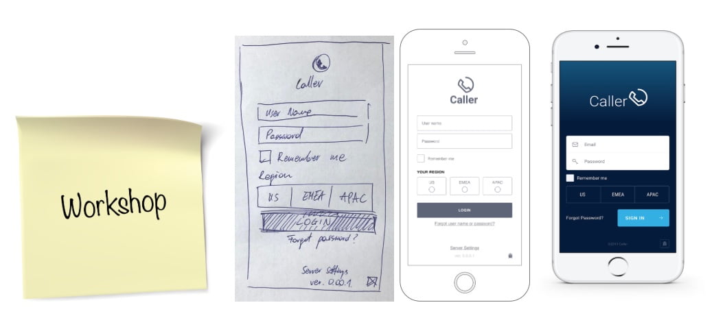
It is a person with whom the client should communicate from the very earliest stages of the development. Cooperation between the originator of the idea and the UX Designer is essential. In itCraft, we start with workshops with our clients that help us understand the most important aspects of the project. At this stage, we collect requirements and record the first interactions. Then we create a prototype of a sketched solution. As a UX Designer we need to understand how users act, think and feel.
The goal of UX Designer’s work: designing intuitive solutions for specific target user groups
Who is a UI Designer?
It is someone who is responsible for visualizing the designed solution in an “aesthetic” manner. UI designer is also responsible for reflecting the company brand in the style of the application.
This is not a simple task due to the fact that different people perceive aesthetics differently. It is important to follow the requirements of a specific user group and ensure the client sees this as more important than their own “feeling’. We design applications dedicated to young people differently to business apps or ones meant for the older generations. The aim of UI Designer’s work is to create a design in line with trends, customer and target group requirements and defined styles (eg Material Design).
The world of UX
The entire UX and UI design process is based on conclusions from researching end-user behaviors as well as verification of ideas and requirements. We identify and study the following:
- who is the end user and what their needs are,
- how we can solve user’s problems.
Next, we examine the user interactions with the solutions we designed as well as check whether the app has a chance to evolve into functionalities in the future.
User Experience Principles
Each of us has certain habits that we often do not even realize. These habits develop naturally when using various applications and devices. If the majority of users use only one hand to operate the phone, using mainly their thumb, then we should make sure that the most important functions are within the reach of that thumb.
Do not make them think
Placing functional elements in the application that differ in appearance or behavior from those commonly used may be problematic for users. If at each demonstration of a working app we need to explain how to use it, then that’s a sure sign something isn’t right.
When designing, we do our best to locate features and buttons where the user expects to find them. We also mark them with icons representing the purpose of the function.
Make it easy
Icons, buttons and other elements of the application’s layout should be separated from each other and large enough. It’s all about readability and a minimal “touch target” field. When it comes to designing forms, keep in mind that users of mobile applications are reluctant to fill out multiple fields on their phones.
The number of text fields should be kept to a minimum and completing made easy. That’s why when creating forms for mobile we use:
- drop down lists,
- sliders,
- value hint boxes,
- automatic focusing on a given field,
- a customized keyboard, e.g. numeric.
Also, when completing forms, the user should not be distracted by other elements of the application (visible app navigation bar, icons of other functions). This way it will be easier to focus on the main task – completing the form.
The phases of design
Research
This phase basically never ends. Analyzing user behavior is necessary even after the project is completed. In the initial stages of the project we need to:
- interview target users,
- define users’ needs and problems they need a solution to,
- define user stories,
- create personas (user profiles).

Subsequent tests on released products give us information about the usefulness of their functionalities. Thanks to this research, we learn how users utilize the application as well as get feedback on how to improve some interactions. Data for such research comes from tools like Google Analytics. We are able to find out how much time users spend on a given screen and which functions they click the most.
It is never the case that the functional value of the product depends solely on the UX Designer’s work. The following are also important:
- consultations with programmers (information on technological limitations),
- consultation with the client and the UI Designer (in cases where the UX and UI Designer roles are separated).
Prototype
Creating the prototype allows us to look at the project from a completely different perspective – we turn a “raw” list of requirements into a visual model of the app. For the purpose of creating a project, we define:
- navigation in the application,
- the main screen,
- location of buttons,
- placement of functionalities previously described in “user stories”.
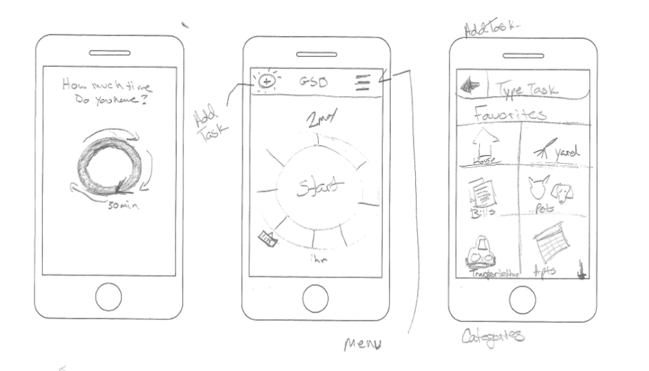
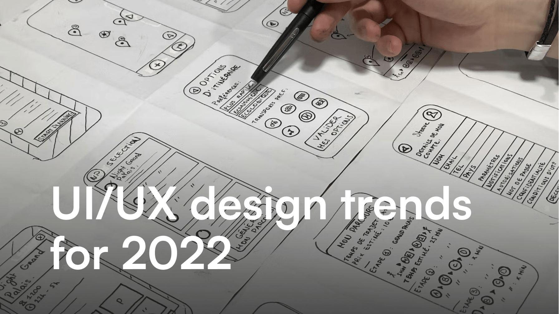
Before we start designing in our tool of choice, a good habit is to draw screens on a piece of paper. We are talking rough sketches that will allow us to pre-plan our work. Another way to start is to write out the “user flow” which describes the dependencies between screens and the User Journey describing individual use cases. This way, we define the number of screens and connections between them.
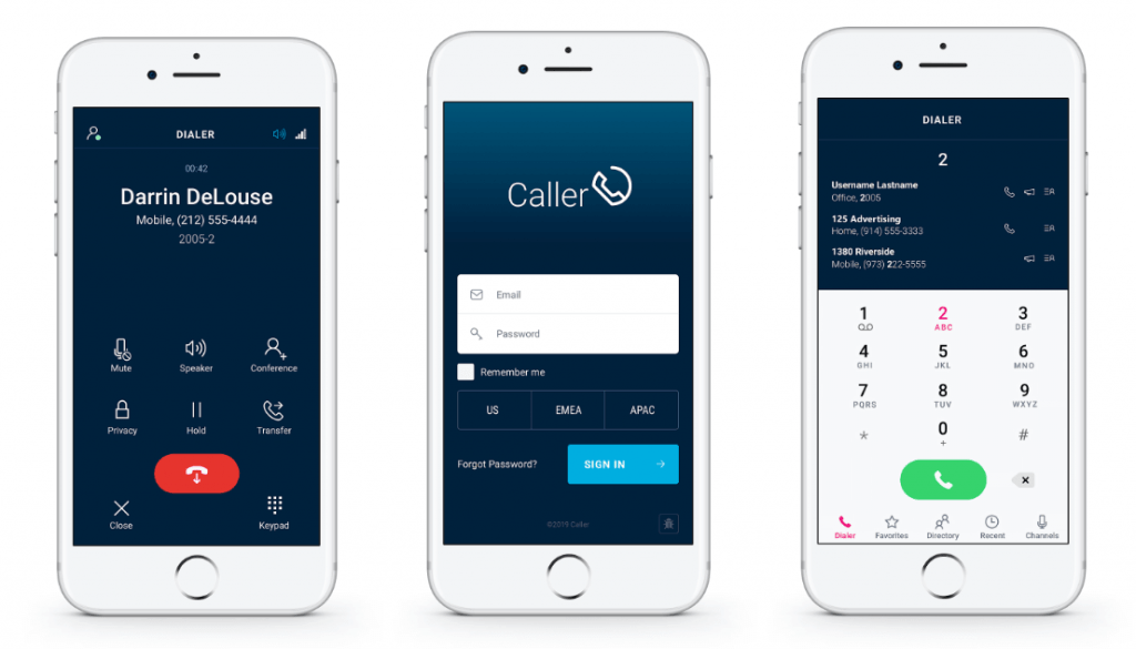
When talking about prototyping tools – in itCraft we use the proto.io, Sketch, and InVision. The most valuable are the tools that allow running the project on a mobile device which gives a better idea of how the actual application will look. Prototypes are made in grayscale – the color scheme is added in the UI design phase.
Test
Do not ask the users what they need. The answers you will get can completely deviate from their real needs. Observe their actions instead. How they use the application, how they access the functions. It might turn out that users expect to find certain functions somewhere else than designed. Everything is possible, so after the application is released to stores / forwarded to target users, you will quickly start receiving feedback and requests to fix/correct the working of the app. The user feedback is invaluable. If users notice that their comments are important and changes are made that increase the comfort of use, they will certainly appreciate it.
Features of good UI
What makes users like an app? What practices can we use to improve the user’s comfort? What is the “perfect look”? – it’s hard to find straight answers. However, there are guidelines and practices in graphic design that we can use.
Simplicity and minimalism
We are all aware of the popular phrase “less is more”. It applies to mobile applications design quite well. As these applications are intended for mobile devices, limited display space makes it a challenge to fit all we need to show in a legible and practical way.
In the case of Android devices, one of the additional challenges is the fact that the market offers devices of various screen sizes. Therefore, when designing applications, we must remember that not everyone will have a device with a 6.5 “screen. Unfortunately, it is not possible to specify the appearance of a given screen for each resolution, so we follow these rules:
- proportionality – values adjust proportionally – not in pixel defined increments,
- scalability – we create graphics using vectors, we work with smart objects (vector graphics work well on Android systems, it is also possible to provide these graphics in .pdf format for iOS (if this is insufficient – see below),
- we provide graphics sets – e.g. one icon in several resolutions.
When designing, we should also take into account that users will use the application in a variety of lighting conditions. Despite the fact that the Internet is flooded with trends related to the use of gradients or low-contrast color combinations, we should still focus on the clarity of the presented functions and data.
Use of Standards
If you are used to one system, it’s a good idea to compare the same application on iOS and Android before you start designing. This will let you design the application in accordance with the guidelines and habits of the users. Unfortunately, sometimes we mistakenly assume that the application should look the same and so should be designed in the same way on both systems. It is better to work keeping in mind which components and schemes are popular for each of the platforms.
While designing the application, we must also take into account the generally accepted rules (some of them can be checked during the verification of the application before releasing to Google Play and/or AppStore). I recommend these for every novice UI Designer :
- Google Material Desing,
- iOS Human Interface Guidelines.
There are also ready-made sets of controls and other interface elements for both platforms available. Thanks to ready-made items, we save time and ensure that the project contains elements that are fully compatible with the system and easy to implement.
Tools and presentation
To create graphic designs in itCraft company we use:
- Adobe Photoshop,
- Sketch,
- Adobe Illustrator.
We also use the InVision tool, which allows us to present ready-made mock-ups to the customer.
Our designers cooperate with the developers using the Zeplin tool. Developers can easily check what font, color, margins were used in a given place as well as refer to style guidelines. This tool also allows you to export icons and graphics.
It is worth keeping in mind that mock-ups are usually presented in only one resolution. This means that the application will not look the same on all devices. Even the colors can display differently depending on the type of screen.
Summary
Design is clearly one of the most important steps in mobile and web app development. Time spent on this stage of work should be enough to ensure top quality. A good UX and UI project is an important element influencing the success of the application. Even the best design might require subsequent changes and adjustments, as user behaviors and sentiments can’t be predicted with a 100% surety. Market trends and system requirements must also be taken into account and included in the design.